From a childhood keyboard to streaming in over 170 countries. An analysis and visualisation of seven years of royalties data to see how my music has been heard, how much Spotify, Apple Music, TikTok, Instagram, etc. really pay per stream, and more.
My parents gifted me my first piano keyboard when I was four. It was small, with a single octave, but it was enough for me to start creating.
Years later, I discovered I could improvise. I was trying to play the intro to Eminem’s Lose Yourself by ear when I realised I could keep playing the chords on the left hand, and let the right hand play freely.
I started recording these improvisations and showing them to close friends and family. My grandma said, in an almost admonishing tone, that it would be “selfish for me to not share my gift with the world”.
A few months after her death, I released my first album, featuring an improvisation made for her when she was in hospital: tólfta (fyrir ömmu).
That was seven years ago today. Seven years of data: streaming numbers, royalties, listeners… I was curious: how many countries has my music reached? How many times has each song been streamed, and where do my earnings come from? And how much do Spotify, Apple Music, TikTok, and Instagram pay per stream?
Click to show the table of contents
The data
My music is available (almost) everywhere, from regional streaming services like JioSaavn (India) or NetEase Cloud Music (China) to Amazon Music, Apple Music, Spotify, Tidal… It can even be added to videos on TikTok and Instagram/Facebook.
I distribute my music through DistroKid (referral link), which lets me keep 100% of the royalties.
Every two or three months, the services provide an earnings report to the distributor. After seven years, I had 29,551 rows like these:
| Reporting Month | Sale Month | Store | Artist | Title | Quantity | Song/Album | Country Of Sale | Earnings (USD) |
|---|
| Mar 2024 | Jan 2024 | Instagram/Facebook | osker wyld | krakkar | 704 | Song | OU | 0.007483664425 |
| Mar 2024 | Jan 2024 | Instagram/Facebook | osker wyld | fimmtánda | 9,608 | Song | OU | 0.102135011213 |
| Mar 2024 | Jan 2024 | Tidal | osker wyld | tólfta (fyrir ömmu) | 27 | Song | MY | 0.121330264483 |
| Mar 2024 | Dec 2023 | iTunes Match | osker wyld | fyrir Olivia | 1 | Song | TW | 0.000313712922 |
My first instinct was to use Python with a couple of libraries: pandas to process the data and seaborn or Plotly for the charts.
However, I was excited to try polars, a “Blazingly Fast DataFrame Library” (it’s true). Similarly, while looking for free software to create beautiful, interactive and web-friendly graphs, I found Vega-Altair, a declarative visualisation library built upon Vega-Lite.
Preparing the data
The data was clean! No missing or invalid values meant I could jump straight into preparing the data for analysis.
The dataset underwent minor transformations: dropping and renaming columns, adjusting store names, and setting column datatypes.
Click to view code
df = pl.read_csv("data/distrokid.tsv", separator="\t", encoding="ISO-8859-1")
df = df.drop(
["Artist", "ISRC", "UPC", "Team Percentage", "Songwriter Royalties Withheld"]
)
df = df.filter(col("Song/Album") != "Album")
df = df.filter(~col("Store").str.contains("iTunes"))
df = df.drop(["Song/Album"])
countries = countries.rename({"Numeric code": "Country numeric code"})
df = df.rename(
{
"Sale Month": "Sale",
"Reporting Date": "Reported",
"Country of Sale": "Country code",
"Earnings (USD)": "Earnings",
"Title": "Song",
}
)
print(f"Before: {df["Store"].unique().to_list()}")
df = df.with_columns(col("Store").str.replace(" (Streaming)", "", literal=True))
df = df.with_columns(col("Store").str.replace("Facebook", "Meta"))
df = df.with_columns(col("Store").str.replace("Google Play All Access", "Google Play Music"))
df = df.with_columns(
col("Sale").str.to_datetime("%Y-%m"),
col("Reported").str.to_datetime("%Y-%m-%d"),
)
If a row pertained to a service with less than 20 total datapoints, I removed it.
Click to view code
store_datapoints = df.group_by("Store").len().sort("len")
min_n = 20
stores_to_drop = list(
    store_datapoints.filter(col("len") < 20).select("Store").to_series()
)
df = df.filter(~col("Store").is_in(stores_to_drop))
In terms of feature engineering—creating new variables from existing data—, I added a “Year” column, retrieved the country codes from another dataset, and calculated the earnings per stream.
Click to view code
countries = pl.read_csv("data/country_codes.csv")
missing_codes = pl.DataFrame(
{
"Country": ["Outside the United States"],
"Alpha-2": ["OU"],
"Alpha-3": [""],
"Country numeric code": [None],
}
)
countries = countries.vstack(missing_codes)
df = df.join(countries, how="left", left_on="Country code", right_on="Alpha-2")
df = df.with_columns(col("Sale").dt.year().alias("Year"))
df = df.with_columns((col("Earnings") / col("Quantity")).alias("USD per stream"))
df = df.with_columns((col("USD per stream") / col("Duration")).alias("USD per second"))
Everything was ready! Time for answers.
How many times has my music been played?
That’s the first question that popped up as I downloaded the dataset. To answer it, I added up the entire “Quantity” (plays) column.
Click to view code
df.select(pl.sum("Quantity")).item()
137,053,871. One hundred thirty-seven million, fifty-three thousand, eight hundred seventy-one.
I had to quadruple-check this value; this made no sense. I’m not a big artist and I’ve barely promoted my music. Sorting the data provided the surprising answer:
| Store | Quantity | Song |
|---|
| Meta | 8,171,864 | áttunda |
| Meta | 6,448,952 | nostalgía |
| Meta | 6,310,620 | áttunda |
| Meta | 3,086,232 | þriðja |
| Meta | 2,573,362 | hvítur |
My music has been used in Instagram and Facebook videos (both owned by Meta) accruing millions of plays. It took me a while to believe these numbers; the few videos I have seen use my music had nowhere near a million views.
How many hours (or days?) is that?
Click to view code
from datetime import datetime, timedelta
from dateutil.relativedelta import relativedelta
seconds_per_stream = 30
start_date = datetime(1, 1, 1)
end_date = start_date + timedelta(seconds=total_quantity * seconds_per_stream)
relativedelta(end_date, start_date)
If we consider each “play” equals to 30 seconds of a person listening to my music, we get a total listening time of over 130 years. Mind-blowing.
30 seconds is the minimum amount of time Spotify or Apple Music require before counting a stream. However, what about Facebook/Instagram? There might be no minimum time. For all I know, users might even have their phone on mute!
Assuming each stream equals ten seconds of my music being heard, we get 43 years of total listening time. Still a crazy figure.
In how many countries has my music been heard?
Click to view code
df.filter(col("Country code") != "OU").select(col("Country")).n_unique()
In total, 171. That’s over 85% of all countries! How has this number grown?
Click to view code
width = "container"
height = 350
year_slider = alt.binding_range(
name="Year ",
min=df["Year"].min(),
max=df["Year"].max(),
step=1,
)
year_selection = alt.selection_point(
fields=["Year"],
value=df["Year"].max(),
empty=True, on="click, touchend",
bind=year_slider,
)
hover = alt.selection_point(
empty=False,
on="mouseover",
clear="mouseout",
fields=["Countries"],
)
num_countries_per_year = (
alt.Chart(unique_countries_per_year)
.mark_bar(color="teal", cursor="pointer")
.encode(
x=alt.X("Year:O", title=None, axis=alt.Axis(labelAngle=0)),
y=alt.Y("Countries:Q", axis=None, scale=alt.Scale(domain=[0, 800])),
opacity=alt.condition(year_selection, alt.value(1), alt.value(0.5)),
strokeWidth=alt.condition(hover, alt.value(2), alt.value(0)),
stroke=alt.condition(hover, alt.value("black"), alt.value(None)),
)
.properties(width="container")
.add_params(year_selection, hover)
)
text_num_countries_per_year = num_countries_per_year.mark_text(
align="center",
baseline="middle",
dy=-10,
fontSize=20,
font="Monospace",
fontWeight="bold",
color="teal",
strokeOpacity=0,
).encode(text="Countries:Q")
bars_with_numbers = num_countries_per_year + text_num_countries_per_year
unique_years = unique_countries_per_year["Year"].unique()
background_data = {"Year": unique_years, "Value": [120] * len(unique_years)}
background_df = pl.DataFrame(background_data)
background_white_bars = (
alt.Chart(background_df)
.mark_area(color="white")
.encode(
x=alt.X("Year:O", title=None, axis=None, scale=alt.Scale(padding=0)),
y=alt.Y("Value:Q", title=None, axis=None, scale=alt.Scale(domain=[0, 800])),
)
.properties(width="container")
)
num_countries_chart = alt.layer(background_white_bars, bars_with_numbers).resolve_scale(
x="independent"
)
plays_per_year_country = (
df.group_by(["Country numeric code", "Country", "Year"])
.agg(col("Quantity").sum())
.sort("Quantity", descending=True)
)
hover_country = alt.selection_point(on="mouseover", empty=False, fields=["Country"])
source = alt.topo_feature(data.world_110m.url, "countries")
projection = "equirectangular"
base = (
alt.Chart(source)
.mark_geoshape(fill="lightgray", stroke="white", strokeWidth=0.5)
.properties(width="container", height=height)
.project(projection)
)
color_scale = alt.Scale(
domain=(
0,
plays_per_year_country["Quantity"].quantile(0.98),
),
scheme="teals",
type="linear",
)
legend = alt.Legend(
title=None,
titleFontSize=14,
labelFontSize=12,
orient="none",
gradientLength=height / 3,
gradientThickness=10,
direction="vertical",
fillColor="white",
legendX=0,
legendY=130,
format="0,.0~s",
tickCount=1,
)
choropleth = (
alt.Chart(plays_per_year_country)
.mark_geoshape(stroke="white")
.encode(
color=alt.Color("Quantity:Q", scale=color_scale, legend=legend),
tooltip=[
alt.Tooltip("Country:N", title="Country"),
alt.Tooltip("Quantity:Q", title="Plays", format=",.0s"),
],
strokeWidth=alt.condition(hover_country, alt.value(2), alt.value(0.5)),
)
.transform_filter(year_selection)
.transform_lookup(
lookup="Country numeric code",
from_=alt.LookupData(source, "id", ["type", "properties", "geometry"]),
)
.project(type=projection)
.properties(width="container", height=height)
.add_params(hover_country)
)
map_with_bars = base + choropleth + num_countries_chart
map_with_bars = configure_chart(
chart=map_with_bars,
)
map_with_bars.display()
Evolution of streams per country over time
The interactive bars at the bottom show the number of countries with listeners per year.
That’s a far more colourful map than I expected. I like to imagine a person in each country hearing my song, even if it’s for a few seconds. I never expected my music to reach this wide of an audience.
What’s the best (and worst) paying service?
NOTE My data may not be representative of the whole streaming industry. Although a big—likely the main—factor in determining the pay rate is the decisions made by top executives, other variables play a role, including the country, number of paying users, and total number of streams for a month. Further, I have limited data from services like Tidal, Snapchat, or Amazon Prime. Refer to the last graph for details on the streams per service.
Click to view code
mean_usd_per_service.select(["USD per stream", "Store"])
def round_to_n_non_zero_decimal(input_float: float, n: float = 2) -> float:
input_str = f"{input_float:.10f}" split_number = re.split("\\.", input_str)
if len(split_number) == 1 or not split_number[1].strip("0"):
return input_float
integer, decimals = split_number
n_decimal_zeroes = re.search("[1-9]", decimals).start()
non_zero_decimals = decimals[n_decimal_zeroes:]
scaled_decimal_for_rounding = int(non_zero_decimals) / 10 ** (
len(non_zero_decimals) - n
)
new_non_zero_decimals_float = round(scaled_decimal_for_rounding, n)
new_non_zero_decimals_str = str(new_non_zero_decimals_float).split(".")[0]
new_zeroes = "".join((["0"] * n_decimal_zeroes))[
len(new_non_zero_decimals_str) - n :
]
new_decimals = new_zeroes + new_non_zero_decimals_str
rounded_number_str = integer + "." + new_decimals
return float(rounded_number_str)
mean_usd_per_service = mean_usd_per_service.with_columns(
col("USD per stream")
.map_elements(round_to_n_non_zero_decimal)
.alias("Rounded USD per stream")
)
bar_chart = (
alt.Chart(mean_usd_per_service)
.mark_bar(cornerRadiusTopRight=15, cornerRadiusBottomRight=15)
.encode(
x=alt.X(
"USD per stream:Q",
axis=alt.Axis(
title=None,
tickCount=5,
labelExpr="datum.value === 0 ? '$0' : format(datum.value, '0,.5~f')",
),
scale=alt.Scale(
type="linear",
),
),
y=alt.Y("Store:N", axis=alt.Axis(title=None), sort="-x"),
color=alt.Color(
"Store:N",
scale=alt.Scale(domain=domain, range=range_), legend=None,
),
)
)
text_chart = bar_chart.mark_text(
align="left",
baseline="middle",
dx=5, fontSize=20,
font="Monospace",
fontWeight="bold",
color="white",
).encode(text=alt.Text("Rounded USD per stream:Q", format=","))
average_pay_per_stream = bar_chart + text_chart
year_credits_text = create_year_credits_text(x=-170, y=570)
average_pay_per_stream = alt.layer(average_pay_per_stream, year_credits_text)
average_pay_per_stream = configure_chart(
chart=average_pay_per_stream,
).properties(
width="container",
height=550,
padding={"left": 0, "top": 0, "right": 30, "bottom": 0},
)
average_pay_per_stream.display()
Average pay per stream
Figures rounded to the first pair of non-zero decimals.
Loading chart…
That’s a lot of zeroes.
I expected Tidal to be near the top, but not Amazon Unlimited.
It’s interesting to see the difference between the paid users of Amazon Music (Amazon Unlimited) and the “free” ones (Amazon Prime). Free in quotes, because Amazon Prime is not free, but users don’t pay extra to access Amazon Music. It would be interesting to compare the pay rates between paid and free users of Spotify, but I don’t have access to this data.
Snapchat being on the top 50% was a surprise. My expectations were that TikTok and Meta wouldn’t pay much: it’s easier to get plays, and the earnings are shared between the video authors and the musicians. However, I feel like there are too many zeroes in the case of Meta, no?
With so many decimals, it’s not easy to make sense of the differences. Let’s try a different approach.
How many streams do I need to earn a single dollar?
Click to view code
streams_for_a_dollar = (
df.group_by("Store")
.agg(
[
streams_for_one_usd(pl.mean("USD per stream")).alias("mean"),
streams_for_one_usd(pl.median("USD per stream")).alias("median"),
]
)
.melt(
id_vars=["Store"],
value_vars=["mean", "median"],
value_name="Value",
variable_name="Metric",
)
)
metric_radio = alt.binding_radio(
options=["mean", "median"], name="Calculation based on"
)
metric_select = alt.selection_point(fields=["Metric"], bind=metric_radio, value="mean")
bar_chart = (
alt.Chart(streams_for_a_dollar)
.mark_bar(cornerRadiusTopRight=15, cornerRadiusBottomRight=15)
.encode(
x=alt.X(
"Value:Q",
title="Streams to reach $1",
axis=alt.Axis(title=None, format="s"),
scale=alt.Scale(type="log"),
),
y=alt.Y(
"Store:N",
title=None,
sort=alt.EncodingSortField(field="Value", op="median", order="ascending"),
),
opacity=alt.condition(metric_select, alt.value(1), alt.value(0)),
color=alt.Color(
"Store:N",
scale=alt.Scale(domain=domain, range=range_),
legend=None,
),
)
.add_params(metric_select)
)
text_chart = bar_chart.mark_text(
align="left",
baseline="middle",
dx=5,
fontSize=20,
font="Monospace",
fontWeight="bold",
).encode(
text=alt.Text("Value:Q", format=","),
)
plays_for_one_dollar = bar_chart + text_chart
year_credits_text = create_year_credits_text(x=-170, y=570)
plays_for_one_dollar = alt.layer(plays_for_one_dollar, year_credits_text)
plays_for_one_dollar = configure_chart(
chart=plays_for_one_dollar,
).properties(width=789, height=550)
plays_for_one_dollar.display()
Plays required to earn $1
Loading chart…
Much clearer.
It’s important to note that the horizontal axis is measured on a logarithmic scale to allow for easier comparison. In a linear graph, Meta’s streams would make the other bars disappear. In a logarithmic scale, the difference between 10 streams and 100 streams is the same visual distance as the difference between 100 streams and 1,000 streams.
100 to 400 streams for a dollar doesn’t sound great. Worst case scenario, based on the median pay rate, we need almost three million plays on Meta to get one United States dollar.
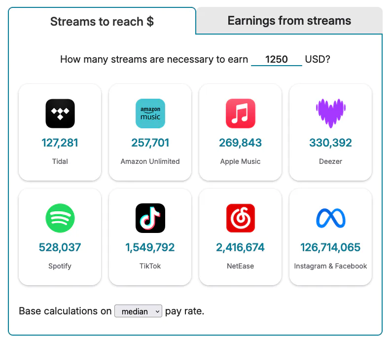
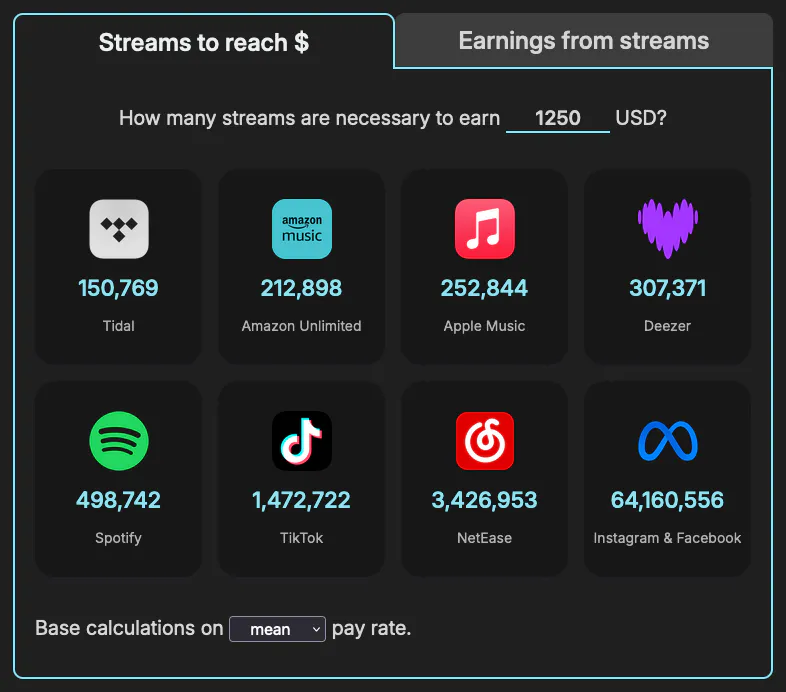
Curious about how many streams are needed to make minimum wage? Or a million dollars? Using this data, I created a streaming royalties calculator. Here’s a screenshot:
Distribution of payments per service
Streaming platforms don’t have a fixed pay rate. Factors like the listener’s geographic location, their subscription status (paid or free user), and the overall streaming volume from the listener’s region affect the pay rate.
Thus, the average pay rate doesn’t tell the whole story: how spread are the payments around the calculated mean? Does this differ by service?
Click to view code
store_payments = df.select(["Store", "USD per stream"])
lower_quantile = 0.01
upper_quantile = 0.99
percentiles = df.group_by("Store").agg(
[
pl.col("USD per stream").quantile(lower_quantile).alias("lower_threshold"),
pl.col("USD per stream").quantile(upper_quantile).alias("upper_threshold"),
]
)
trimmed_df = (
df.join(percentiles, on="Store", how="left")
.filter(
(pl.col("USD per stream") >= pl.col("lower_threshold"))
& (pl.col("USD per stream") <= pl.col("upper_threshold"))
)
.drop(["lower_threshold", "upper_threshold"])
)
jittered_scatter_plot = (
alt.Chart(trimmed_df)
.mark_circle(size=60, opacity=0.2)
.encode(
x=alt.X(
"USD per stream:Q",
axis=alt.Axis(
title=None,
labelExpr="datum.value === 0 ? '$0' : format(datum.value, '0,.5~f')",
),
),
y=alt.Y(
"Store:N",
sort=alt.EncodingSortField(
field="USD per stream", op="median", order="descending"
),
axis=alt.Axis(title=None),
),
color=alt.Color(
"Store:N",
scale=alt.Scale(domain=domain, range=range_), legend=None,
),
yOffset=alt.Y("jitter:Q", title=None),
)
.transform_calculate(jitter="sqrt(-2*log(random()))*cos(2*PI*random())")
)
median_dots = (
alt.Chart(trimmed_df)
.mark_point(opacity=1, shape="diamond", filled=False, size=120)
.encode(
x="median(USD per stream):Q",
y=alt.Y(
"Store:N",
sort=alt.EncodingSortField(
field="USD per stream", op="median", order="descending"
),
axis=None,
),
color=alt.value("black"),
tooltip=[
alt.Tooltip("Store", title="Service"),
alt.Tooltip("median(USD per stream)", title="Median pay rate"),
],
)
)
final_plot_with_jitter = alt.layer(jittered_scatter_plot, median_dots).resolve_scale(
y="independent"
)
year_credits_text = create_year_credits_text(x=-170, y=570)
final_plot_with_jitter = alt.layer(final_plot_with_jitter, year_credits_text)
final_plot_with_jitter = configure_chart(
chart=final_plot_with_jitter,
).properties(width="container", height=550)
final_plot_with_jitter.display()
Pay per stream distribution
Each circle represents a single payout. The diamond marks the median payout rate.
The graph excludes the top and bottom 1% of payouts per service to focus on the most representative data.
Loading chart…
The range for Amazon Unlimited and Apple Music is massive, overlapping with the median of more than half the services.
Spotify, Saavn and Meta have many payouts at near-zero dollars per stream. Of these three, Spotify stands out by reaching pay rates of well past half a cent.
Come to think of it, during data processing I removed a few (72) instances of Spotify and Meta (38) paying infinite USD per stream. These were entries with 0 streams but non-zero earnings—likely adjusting previous payments. In any case, Spotify and Meta win a medal for the largest—infinite—range.
Comparing the distribution of any two services
I made this little interactive chart to compare the pay rate distribution between any two services:
Click to view code
store_usd_per_stream = trimmed_df.select(["Store", "USD per stream"])
dropdown_store_1 = alt.binding_select(options=unique_stores, name="Service B ")
dropdown_store_2 = alt.binding_select(options=unique_stores, name="Service A ")
selection_store_1 = alt.selection_point(
fields=["Store"], bind=dropdown_store_1, value="Spotify"
)
selection_store_2 = alt.selection_point(
fields=["Store"], bind=dropdown_store_2, value="Apple Music"
)
min_usd_per_stream = trimmed_df["USD per stream"].min()
max_usd_per_stream = trimmed_df["USD per stream"].max()
base_density_chart = alt.Chart(store_usd_per_stream).transform_density(
density="USD per stream",
bandwidth=0.0004,
extent=[min_usd_per_stream, max_usd_per_stream],
groupby=["Store"],
as_=["USD per stream", "Density"],
)
density_plot_1 = (
base_density_chart.transform_filter(selection_store_1)
.mark_area(opacity=0.6)
.encode(
x=alt.X(
"USD per stream:Q",
title=None,
axis=alt.Axis(
grid=False,
labelExpr="datum.value === 0 ? '$0' : format(datum.value, '0,.5~f')",
),
),
y=alt.Y("Density:Q", title=None, axis=None),
color=alt.Color(
"Store:N", legend=None, scale=alt.Scale(domain=domain, range=range_)
),
tooltip=[alt.Tooltip("Store", title="Service")],
)
.add_params(selection_store_1)
)
density_plot_2 = (
base_density_chart.transform_filter(selection_store_2)
.mark_area(opacity=0.6)
.encode(
x=alt.X("USD per stream:Q", title=None),
y=alt.Y("Density:Q", title=None, axis=None),
color=alt.Color(
"Store:N", legend=None, scale=alt.Scale(domain=domain, range=range_)
),
tooltip=[alt.Tooltip("Store", title="Service")],
)
.add_params(selection_store_2)
)
overlaid_density_plots = alt.layer(density_plot_1, density_plot_2)
compare_distributions = configure_chart(
chart=overlaid_density_plots,
).properties(width="container", height=200)
compare_distributions.display()
It uses kernel density estimation to approximate the distribution of payments per stream. You can think of it as a smoothed histogram.
Peaks in the plot indicate how concentrated the data is around that value.
Select a few services to compare the spread, the overlaps and divergences, and the thickness of the tails (called kurtosis). Can you guess any payment policies from this data?
Does Apple Music pay $0.01 per stream?
In 2021, Apple reported their average per play rate was $0.01.
The graphs above show my average pay rate from Apple Music is not close to a cent per stream. It’s closer to half a cent.
Click to view code
apple_music_df = df.filter(col("Store") == "Apple Music")
apple_music_df.select("USD per stream").describe()
total_apple_music_streams = apple_music_df.count().select("Quantity").item()
streams_over_80_percent_apple_music = (
apple_music_df.filter(col("USD per stream") > 0.008)
.count()
.select("Quantity")
.item()
)
Looking at the entire span of data (2017 to 2023) I noticed:
- Three quarters of all streams had a pay rate below $0.006 (the 75th percentile);
- Less than 15% of my payments are above $0.008 (80% of a cent).
In my case, the answer is “no”. However, a reported mean is not a promise; there’s another artist out there with an average pay rate greater than $0.01.
How much would I have lost with Spotify’s new pay model?
Starting this year, Spotify’s “modernised” royalty system will pay $0 on songs with less than a thousand streams per year.
Had this model been implement seven years ago, I’m certain I would’ve missed out on a big chunk of Spotify payments.
Click to view code
spotify_df = df.filter(col("Store") == "Spotify")
grouped_spotify = (
    spotify_df.group_by(["Year", "Song"])
    .sum()
    .select(["Year", "Song", "Quantity", "Earnings"])
    .sort("Quantity", descending=False)
)

spotify_per_year = (
    grouped_spotify.group_by("Year")
    .sum()
    .select(["Year", "Quantity", "Earnings"])
    .sort("Year")
)

unpaid_streams = grouped_spotify.filter(col("Quantity") < 1000)
unpaid_streams_per_year = (
    unpaid_streams.group_by("Year")
    .sum()
    .select(["Year", "Quantity", "Earnings"])
    .sort("Year")
)

spotify_yearly_earnings = spotify_per_year.join(
    other=unpaid_streams_per_year,
    on="Year",
    how="left",
    suffix="_unpaid",
)

unpaid_spotify = spotify_yearly_earnings.with_columns(
    (col("Quantity_unpaid") / col("Quantity") * 100).alias("Unpaid streams %"),
    (col("Earnings_unpaid") / col("Earnings") * 100).alias("Unpaid USD %"),
)

unpaid_spotify_dollars = unpaid_spotify.select(pl.sum("Earnings_unpaid")).item()
print(
    f'Had the "modernized" royalty system been applied for the last {spotify_per_year.height} years, I would\'ve missed out on USD {round(unpaid_spotify_dollars, 2)},'
)
print(
    f"which represents {round(unpaid_spotify_dollars / spotify_per_year.select(pl.sum('Earnings')).item() * 100, 2)}% of my Spotify earnings."
)
Indeed, the new system would’ve denied me $112.01. That’s 78.7% of my Spotify earnings to date.
These earnings, generated by my songs, instead of reaching me, would’ve been distributed amongst the other “elegible tracks”.
Do longer songs pay more?
Click to view code
df.select(pl.corr("Duration", "USD per stream", method="spearman"))
df.select(pl.corr("Duration", "USD per stream", method="pearson"))
Nope. In my data, the length of the song does not correlate with the pay rate.
CAVEAT My catalog consists of short improvisations; there’s not much range in terms of duration. My shortest song, tíunda, spans 44 seconds, and the longest one, sextánda, is 3 minutes and 19 seconds “long”
I recall reading the payment model of TikTok rewards more generously the use of a song across several videos than a single video with many views.
To check whether this was the case in TikTok and Meta, I calculated the correlation between two pairs of variables: number of plays & pay rate, and number of plays & total earnings.
If what I read was true, we would expect a decreasing pay rate as the view count increases (negative correlation), and a low correlation between total streams and earnings.
Click to view code and correlation coefficients
metrics_pairs = [("Quantity", "USD per stream"), ("Quantity", "Earnings")]
stores = ["Meta", "TikTok"]
correlation_results = {}
for store in stores:
filtered_data = df.filter(pl.col("Store") == store)
for metrics_pair in metrics_pairs:
pearson_corr = filtered_data.select(
pl.corr(metrics_pair[0], metrics_pair[1], method="pearson")
).item()
spearman_corr = filtered_data.select(
pl.corr(metrics_pair[0], metrics_pair[1], method="spearman")
).item()
correlation_results[f"{store} {metrics_pair[0]}-{metrics_pair[1]} Pearson"] = (
pearson_corr
)
correlation_results[f"{store} {metrics_pair[0]}-{metrics_pair[1]} Spearman"] = (
spearman_corr
)
for key, value in correlation_results.items():
print(f"{key}: {round(value, 2)}")
For TikTok, as a video gets more plays, the total earnings increase (very strong linear positive correlation). In the case of Meta, while there’s a robust correlation, it’s less linear.
The pay rate of TikTok appears to be independent of the number of plays. In the case of Meta, there appears to be a moderate non-linear correlation.
In conclusion, the total number of plays is the relevant factor when determining earnings, rather than number of videos that use a song.
What are the countries with the highest and lowest average pay rate?
Click to view code
n = 5
col_of_interest = "Country"

mean_usd_per_stream_per_country = (
    df.group_by(col_of_interest)
    .mean()
    .select(["USD per stream", col_of_interest])
    .with_columns(
        streams_for_one_usd(col("USD per stream")).alias("Streams to reach $1")
    )
    .sort("USD per stream", descending=True)
)

print(f"Top {n} best paying countries:")
display(mean_usd_per_stream_per_country.head(n))
print(f"Top {n} worst paying countries:")
display(mean_usd_per_stream_per_country.tail(n).reverse())
Five countries with highest average payout:
| Country | Streams to reach $1 |
|---|
| 🇲🇴 Macao | 212 |
| 🇯🇵 Japan | 220 |
| 🇬🇧 United Kingdom | 237 |
| 🇱🇺 Luxembourg | 237 |
| 🇨🇭 Switzerland | 241 |
Five countries with lowest average payout:
| Country | Streams to reach $1 |
|---|
| 🇸🇨 Seychelles | 4,064,268 |
| 🇱🇸 Lesotho | 4,037,200 |
| 🇫🇷 French Guiana | 3,804,970 |
| 🇱🇮 Liechtenstein | 3,799,514 |
| 🇲🇨 Monaco | 3,799,196 |
Other factors such as the service might be affecting the results: what if the majority of users from the top paying countries happen to be using a top paying service, and vice-versa?
It would be nice to build a hierarchical linear model to account for the variability at each level (service and country). That’s an idea for a future post.
For now, stratification will suffice. I grouped the data by service and country, giving me the top and bottom five combinations of country-service.
Click to view code
mean_usd_per_stream_per_country_service = (
    df.group_by(["Country", "Store"])
    .mean()
    .select(["USD per stream", "Country", "Store"])
    .with_columns(
        streams_for_one_usd(col("USD per stream")).alias("Streams to reach $1")
    )
    .sort("USD per stream", descending=True)
)

print(f"Top {n} best paying countries and services:")
display(mean_usd_per_stream_per_country_service.head(n))

print(f"Top {n} worst paying countries and services:")
display(mean_usd_per_stream_per_country_service.tail(n).reverse())
Five country-service combinations with highest average payout:
| Country | Service | Streams to reach $1 |
|---|
| 🇬🇧 United Kingdom | Amazon Unlimited | 60 |
| 🇮🇸 Iceland | Apple Music | 67 |
| 🇺🇸 United States | Tidal | 69 |
| 🇺🇸 United States | Amazon Unlimited | 79 |
| 🇳🇱 Netherlands | Apple Music | 84 |
Five country-service combinations with lowest average payout:
| Country | Service | Streams to reach $1 |
|---|
| 🇸🇨 Seychelles | Meta | 4,064,268 |
| 🇱🇸 Lesotho | Meta | 4,037,200 |
| 🇮🇸 Iceland | Meta | 3,997,995 |
| 🇫🇷 French Guiana | Meta | 3,804,970 |
| 🇱🇮 Liechtenstein | Meta | 3,799,514 |
Meta’s pay rate being near zero doesn’t help. If we filter it out, we get:
| Country | Service | Streams to reach $1 |
|---|
| 🇬🇭 Ghana | Spotify | 1,000,000 |
| 🇪🇸 Spain | Deezer | 652,153 |
| 🇸🇻 El Salvador | Deezer | 283,041 |
| 🇰🇿 Kazakhstan | Spotify | 124,572 |
| 🇪🇬 Egypt | Spotify | 20,833 |
It’s important to note that the subscription price of services like Spotify is different in each country. For example, Spotify Premium costs ~$1.3 in Ghana and ~$16 in Denmark.
In a world with reduced inequality, this comparison would make less sense.
How has the distribution of streams and revenue changed across services over time?
Click to view code
width = 896
height = 200
mouseover_highlight = alt.selection_point(
fields=["Store"],
on="mouseover",
clear="mouseout",
)
filter_selection = alt.selection_point(
fields=["Store"],
bind="legend",
toggle="true",
)
music_streaming_checkbox = alt.binding_checkbox(name=filter_social_media_label)
checkbox_selection = alt.selection_point(
bind=music_streaming_checkbox, fields=["IsMusicStreaming"], value=False
)
min_sale, max_sale = map(str, (df["Sale"].min(), df["Sale"].max()))
base_chart = (
alt.Chart(sales_per_store_time)
.transform_filter(
filter_selection & (checkbox_selection | (alt.datum.IsMusicStreaming == True))
)
.transform_joinaggregate(
TotalQuantity="sum(Quantity)", TotalEarnings="sum(Earnings)", groupby=["Sale"]
)
.transform_calculate(
PercentageQuantity="datum.Quantity / datum.TotalQuantity",
PercentageEarnings="datum.Earnings / datum.TotalEarnings",
)
.add_params(filter_selection, mouseover_highlight, checkbox_selection)
)
areachart_quantity = (
base_chart.mark_area()
.encode(
x=alt.X(
"yearmonth(Sale):T", axis=None, scale=alt.Scale(domain=(min_sale, max_sale))
),
y=alt.Y(
"PercentageQuantity:Q",
stack="center",
axis=alt.Axis(
title="Streams",
labelExpr="datum.value === 1 ? format(datum.value * 100, '') + '%' : format(datum.value * 100, '')",
titleFontSize=16,
titlePadding=15,
titleColor="gray",
),
),
color=alt.Color("Store:N", scale=alt.Scale(domain=domain, range=range_)),
fillOpacity=alt.condition(mouseover_highlight, alt.value(1), alt.value(0.4)),
tooltip=[
alt.Tooltip("Store:N", title="Service"),
alt.Tooltip("yearmonth(Sale):T", title="Date", format="%B %Y"),
alt.Tooltip("PercentageQuantity:Q", title="% of streams", format=".2%"),
alt.Tooltip("PercentageEarnings:Q", title="% of payments", format=".2%"),
],
)
.properties(width=width, height=height)
)
areachart_earnings = (
base_chart.mark_area()
.encode(
x=alt.X(
"yearmonth(Sale):T",
axis=alt.Axis(
domain=False, format="%Y", tickSize=0, tickCount="year", title=None
),
scale=alt.Scale(domain=(min_sale, max_sale)),
),
y=alt.Y(
"PercentageEarnings:Q",
stack="center",
axis=alt.Axis(
title="Earnings",
labelExpr="datum.value === 1 ? format(datum.value * 100, '') + '%' : format(datum.value * 100, '')",
tickCount=4,
titleFontSize=16,
titlePadding=15,
titleColor="gray",
),
),
color=alt.Color("Store:N", scale=alt.Scale(domain=domain, range=range_)),
fillOpacity=alt.condition(mouseover_highlight, alt.value(1), alt.value(0.4)),
tooltip=[
alt.Tooltip("Store:N", title="Service"),
alt.Tooltip("yearmonth(Sale):T", title="Date", format="%B %Y"),
alt.Tooltip("PercentageQuantity:Q", title="% of streams", format=".2%"),
alt.Tooltip("PercentageEarnings:Q", title="% of payments", format=".2%"),
],
)
.properties(width=width, height=height)
)
combined_areachart = alt.vconcat(
areachart_quantity, areachart_earnings, spacing=10
).resolve_scale(x="shared")
combined_areachart = configure_chart(
chart=combined_areachart,
legend_position="top",
legend_columns=7,
)
combined_areachart.display()
Percentage of streams and earnings by service over time
Loading chart…
That’s a lot of colours! You can filter the services shown by clicking on the legend. Hovering over a colour will show you more details like the service it represents, the date, and the percentage of streams and revenue generated by this store.
I find it interesting that, starting in July 2019, Meta starts to dominate in terms of plays, but not in earnings. For a few months, despite consistently representing over 97% of streams, it generates less than 5% of the revenue. It’s not until April 2022 that it starts to even out.
By filtering out social media data (Facebook, Instagram, TikTok and Snapchat) using the checkbox below the graphs, we see a similar but less obvious pattern with NetEase starting in mid-2020.
How have total streams and earnings changed across the services over time?
Let’s focus on the raw numbers now. Here’s a couple of classic bar graphs analogous to the area charts above.
Click to view code
height = 200
width = 893
base_chart = (
alt.Chart(sales_per_store_time)
.transform_filter(
filter_selection & (checkbox_selection | (alt.datum.IsMusicStreaming == True))
)
.transform_filter(filter_selection)
.transform_window(
TotalQuantity="sum(Quantity)", TotalEarnings="sum(Earnings)", groupby=["Sale"]
)
.transform_calculate(
USD_per_Stream="datum.Earnings / datum.Quantity",
PercentOfStreams="datum.Quantity / datum.TotalQuantity",
PercentOfEarnings="datum.Earnings / datum.TotalEarnings",
)
)
quantity_bar_chart = (
base_chart.mark_bar()
.encode(
x=alt.X(
"yearmonth(Sale):T", axis=None, scale=alt.Scale(domain=(min_sale, max_sale))
),
y=alt.Y(
"Quantity:Q",
axis=alt.Axis(
format="0,.2~s",
title="Streams",
tickCount=4,
titleFontSize=16,
titlePadding=15,
titleColor="gray",
),
),
color=alt.Color("Store:N", scale=alt.Scale(domain=domain, range=range_)),
opacity=alt.condition(mouseover_highlight, alt.value(1), alt.value(0.4)),
tooltip=[
alt.Tooltip("Store:N", title="Service"),
alt.Tooltip("yearmonth(Sale):T", title="Date", format="%B %Y"),
alt.Tooltip("Quantity:Q", title="Streams", format="0,.2~f"),
alt.Tooltip("Earnings:Q", title="Earnings", format="$0,.2~f"),
alt.Tooltip("USD_per_Stream:Q", title="$ per stream", format="$,.2r"),
alt.Tooltip("PercentOfStreams:Q", title="% of streams", format=".2%"),
alt.Tooltip("PercentOfEarnings:Q", title="% of payments", format=".2%"),
],
)
.add_params(filter_selection, mouseover_highlight, checkbox_selection)
)
earnings_bar_chart = (
base_chart.mark_bar()
.encode(
x=alt.X(
"yearmonth(Sale):T",
axis=alt.Axis(
format="%Y", tickCount=alt.TimeInterval("year"), title=None, grid=False
),
scale=alt.Scale(domain=(min_sale, max_sale)),
),
y=alt.Y(
"Earnings:Q",
axis=alt.Axis(
format="0,.2~f",
title="Earnings (USD)",
tickCount=4,
titleFontSize=16,
titlePadding=15,
titleColor="gray",
),
),
color=alt.Color("Store:N", scale=alt.Scale(domain=domain, range=range_)),
opacity=alt.condition(mouseover_highlight, alt.value(1), alt.value(0.4)),
tooltip=[
alt.Tooltip("Store:N", title="Service"),
alt.Tooltip("yearmonth(Sale):T", title="Date", format="%B %Y"),
alt.Tooltip("Quantity:Q", title="Streams", format="0,.2~f"),
alt.Tooltip("Earnings", title="Paid", format="$0,.2~f"),
alt.Tooltip("USD_per_Stream:Q", title="$ per stream", format="$,.2r"),
alt.Tooltip("PercentOfStreams:Q", title="% of streams", format=".2%"),
alt.Tooltip("PercentOfEarnings:Q", title="% of payments", format=".2%"),
],
)
.add_params(filter_selection, mouseover_highlight, checkbox_selection)
)
quantity_bar_chart = quantity_bar_chart.properties(
height=height,
width=width,
)
earnings_bar_chart = earnings_bar_chart.properties(
height=height,
width=width,
)
streams_and_earnings_by_service_over_time = alt.vconcat(
quantity_bar_chart,
earnings_bar_chart,
spacing=20,
)
streams_and_earnings_by_service_over_time = configure_chart(
chart=streams_and_earnings_by_service_over_time,
legend_position="top",
legend_columns=7,
)
streams_and_earnings_by_service_over_time.display()
Total streams and earnings by service over time
Click on the legend to show/hide specific services.
Loading chart…
Again, the Meta streams/earnings divergence is obvious.
The magnitude of the numbers coming from Instagram/Facebook makes it look like I had zero plays before July 2019. Filtering out this service updates the vertical axis, telling a different story.
These graphs show something we couldn’t see before: the raw growth.
In February 2022 I released my second album, II. Not long after, the Meta plays skyrocketed; one of the improvisations in this album, hvítur, gained popularity there.
The increase in plays after the album release is less obvious in the music streaming services.
What’s the distribution of streams and earnings across songs?
Do a few tracks get the majority of plays? Do the ranking of streams and earnings match?
Click to view code
song_quantity_per_store = (
df.group_by(["Song", "Store"])
.agg(col("Quantity").sum(), col("IsMusicStreaming").first())
.sort("Quantity", descending=True)
)
default_show_n = 10
num_unique_songs = len(df["Song"].unique())
element_slider = alt.binding_range(
min=1, max=num_unique_songs, step=1, name="Show only top "
)
slider_selection = alt.selection_point(
fields=["N"], bind=element_slider, value=default_show_n
)
song_streams_chart = (
alt.Chart(song_quantity_per_store)
.mark_bar()
.transform_filter(
filter_selection & (checkbox_selection | (alt.datum.IsMusicStreaming == True))
)
.transform_joinaggregate(TotalStreamsPerSong="sum(Quantity)", groupby=["Song"])
.transform_window(
rank="dense_rank()",
sort=[alt.SortField("TotalStreamsPerSong", order="descending")],
)
.transform_filter(alt.datum.rank <= slider_selection.N)
.encode(
x=alt.X(
"Song:N",
sort="-y",
axis=alt.Axis(title=None, labelLimit=85),
),
y=alt.Y(
"sum(Quantity):Q",
axis=alt.Axis(
format="0,.2~s",
title="Streams",
tickCount=4,
titleFontSize=16,
titlePadding=15,
titleColor="gray",
),
),
color=alt.Color("Store:N", scale=alt.Scale(domain=domain, range=range_)),
tooltip=[
alt.Tooltip("Song:N", title="Song"),
alt.Tooltip("TotalStreamsPerSong:Q", title="Total plays", format="0,.4~s"),
alt.Tooltip("Store:N", title="Service"),
alt.Tooltip("sum(Quantity):Q", title="Service plays", format="0,.4~s"),
],
)
.add_params(filter_selection, checkbox_selection, slider_selection)
)
song_earnings_per_store = (
df.group_by(["Song", "Store"])
.agg(col("Earnings").sum(), col("IsMusicStreaming").first())
.sort("Earnings", descending=True)
)
song_earnings_per_store.head(2)
song_earnings_chart = (
alt.Chart(song_earnings_per_store)
.mark_bar()
.transform_filter(
filter_selection & (checkbox_selection | (alt.datum.IsMusicStreaming == True))
)
.transform_joinaggregate(TotalStreamsPerSong="sum(Earnings)", groupby=["Song"])
.transform_window(
rank="dense_rank()",
sort=[alt.SortField("TotalStreamsPerSong", order="descending")],
)
.transform_filter(alt.datum.rank <= slider_selection.N)
.encode(
x=alt.X(
"Song:N",
sort="-y",
axis=alt.Axis(title=None, labelLimit=85),
),
y=alt.Y(
"sum(Earnings):Q",
axis=alt.Axis(
title="Earnings (USD)",
tickCount=4,
titleFontSize=16,
titlePadding=15,
titleColor="gray",
),
),
color=alt.Color("Store:N", scale=alt.Scale(domain=domain, range=range_)),
tooltip=[
alt.Tooltip("Song:N", title="Song"),
alt.Tooltip(
"TotalStreamsPerSong:Q", title="Total earnings", format="$0,.2~f"
),
alt.Tooltip("Store:N", title="Service"),
alt.Tooltip("sum(Earnings):Q", title="Service earnings", format="$0,.2~f"),
],
)
.add_params(filter_selection, checkbox_selection, slider_selection)
)
width = 905
height = 200
song_streams_chart = song_streams_chart.properties(width=width, height=height)
song_earnings_chart = song_earnings_chart.properties(width=width, height=height)
total_song_earnings_streams_chart = alt.vconcat(song_streams_chart, song_earnings_chart)
total_song_earnings_streams_chart = configure_chart(
chart=total_song_earnings_streams_chart,
legend_position="top",
legend_columns=7,
)
total_song_earnings_streams_chart.display()
Total streams and earnings per song
Loading chart…
To me, this is one of the most interesting visualisations; it’s full of information.
- Only two out of the top five most streamed songs are shared between social media data and music streaming services.
- hvítur, the song with the largest number of streams (over 34 million!) is number one thanks to Meta. If we filter out social media plays, it’s not even in the top 20.
- The ranking of plays doesn’t consistently align with the ranking of earnings. As a clear example, the fifth most streamed song, We Don’t—a collaboration with Avstånd (previously Bradycardia)—ranks near the bottom in terms of earnings.
- The colour of the bars helps explain this divergence in plays and earnings. Additionally, it shows the popularity of the tracks differs by service.
Let’s look further into the colours (the services).
Are a small number of services responsible for a majority of earnings and plays?
Click to view code
store_earnings = (
df.group_by("Store").agg(col("Earnings").sum()).sort("Earnings", descending=True)
)
total_earnings = store_earnings["Earnings"].sum()
store_earnings_cumulative_percentage = store_earnings.with_columns(
(col("Earnings").cum_sum() / total_earnings).alias("Cumulative percentage")
)
store_earnings_cumulative_percentage.head()
sort_order = list(store_earnings_cumulative_percentage["Store"])
num_unique_stores = len(df["Store"].unique())
element_slider = alt.binding_range(
min=1, max=num_unique_stores, step=1, name="Show only top "
)
slider_selection = alt.selection_point(fields=["N"], bind=element_slider, value=5)
pareto_checkbox = alt.binding_checkbox(name="Pareto chart")
show_hide_pareto = alt.param(name="show_pareto", bind=pareto_checkbox, value=False)
pareto_elements_opacity = alt.condition(show_hide_pareto, alt.value(1), alt.value(0))
filtered_data = (
alt.Chart(store_earnings_cumulative_percentage)
.transform_window(
rank="dense_rank()",
sort=[alt.SortField("Earnings", order="descending")],
)
.transform_filter((alt.datum.rank <= slider_selection.N))
.encode(
x=alt.X(
"Store:N",
sort=sort_order,
axis=alt.Axis(
title=None,
),
)
)
.add_params(slider_selection)
)
earnings_per_store = filtered_data.mark_bar().encode(
y=alt.Y(
"Earnings:Q",
axis=alt.Axis(
title="Earnings (USD)",
format="0,.2~f",
tickCount=2,
titleFontSize=16,
titlePadding=15,
titleColor="gray",
),
scale=alt.Scale(type="log"),
),
color=alt.Color(
"Store:N", scale=alt.Scale(domain=domain, range=range_), legend=None
),
)
bars_text = earnings_per_store.mark_text(
align="center",
baseline="bottom",
dy=-5,
fontSize=20,
font="Monospace",
fontWeight="bold",
).encode(text=alt.Text("Earnings:Q", format="$,.2f"))
earnings_per_store_with_labels = earnings_per_store + bars_text
pareto_colour = "#1e2933"
cumulative_percentage_line = filtered_data.mark_line(
color=pareto_colour, size=3
).encode(
y=alt.Y(
"Cumulative percentage:Q",
axis=None,
scale=alt.Scale(domain=[0, 1]),
),
opacity=pareto_elements_opacity,
)
cumulative_percentage_points = filtered_data.mark_circle(
size=42, color=pareto_colour
).encode(y=alt.Y("Cumulative percentage:Q", axis=None), opacity=pareto_elements_opacity)
pareto_text = filtered_data.mark_text(
align="center",
baseline="bottom",
dy=-12,
fontSize=18,
font="Monospace",
fontWeight="bold",
color=pareto_colour,
).encode(
y=alt.Y("Cumulative percentage:Q", title=None),
text=alt.Text("Cumulative percentage:Q", format=".1%"),
opacity=pareto_elements_opacity,
)
pareto_plot = alt.layer(
cumulative_percentage_line,
cumulative_percentage_points,
pareto_text,
)
earnings_per_store_pareto = (
alt.layer(earnings_per_store_with_labels, pareto_plot)
.resolve_scale(y="independent")
.add_params(show_hide_pareto)
)
store_quantity = (
df.group_by("Store").agg(col("Quantity").sum()).sort("Quantity", descending=True)
)
total_quantity = store_quantity["Quantity"].sum()
store_quantity_cumulative_percentage = store_quantity.with_columns(
(col("Quantity").cum_sum() / total_quantity).alias("Cumulative percentage")
)
store_quantity_cumulative_percentage.head()
sort_order = list(store_quantity_cumulative_percentage["Store"])
filtered_data = (
alt.Chart(store_quantity_cumulative_percentage)
.transform_window(
rank="dense_rank()",
sort=[alt.SortField("Quantity", order="descending")],
)
.transform_filter((alt.datum.rank <= slider_selection.N))
.encode(x=alt.X("Store:N", sort=sort_order, title=None))
.add_params(slider_selection)
)
quantity_per_store = filtered_data.mark_bar().encode(
y=alt.Y(
"Quantity:Q",
axis=alt.Axis(
title="Streams",
format="s",
tickCount=4,
labelLimit=85,
titleFontSize=16,
titlePadding=15,
titleColor="gray",
),
scale=alt.Scale(type="log"),
),
color=alt.Color(
"Store:N", scale=alt.Scale(domain=domain, range=range_), legend=None
),
)
bars_text = quantity_per_store.mark_text(
align="center",
baseline="bottom",
dy=-5,
fontSize=20,
font="Monospace",
fontWeight="bold",
).encode(text=alt.Text("Quantity:Q", format="0,.2~f"))
quantity_per_store_with_labels = quantity_per_store + bars_text
pareto_colour = "#1e2933"
cumulative_percentage_line = filtered_data.mark_line(
color=pareto_colour, size=3
).encode(
y=alt.Y(
"Cumulative percentage:Q",
title=None,
scale=alt.Scale(domain=[0, 1]),
),
opacity=pareto_elements_opacity,
)
cumulative_percentage_points = filtered_data.mark_circle(
size=42, color=pareto_colour
).encode(y=alt.Y("Cumulative percentage:Q", axis=None), opacity=pareto_elements_opacity)
pareto_text = filtered_data.mark_text(
align="center",
baseline="bottom",
dy=-12,
fontSize=18,
font="Monospace",
fontWeight="bold",
color=pareto_colour,
).encode(
y=alt.Y("Cumulative percentage:Q", title=None),
text=alt.Text("Cumulative percentage:Q", format=".1%"),
opacity=pareto_elements_opacity,
)
pareto_plot = alt.layer(
cumulative_percentage_line,
cumulative_percentage_points,
pareto_text,
)
streams_per_store_pareto = (
alt.layer(quantity_per_store_with_labels, pareto_plot)
.resolve_scale(y="independent")
.add_params(show_hide_pareto)
)
width = 896
height = 200
earnings_per_store_pareto = earnings_per_store_pareto.properties(
width=width, height=height
)
streams_per_store_pareto = streams_per_store_pareto.properties(
width=width, height=height
)
total_streams_earnings_pareto_stacked = alt.vconcat(
streams_per_store_pareto, earnings_per_store_pareto
)
total_streams_earnings_pareto_stacked = configure_chart(
chart=total_streams_earnings_pareto_stacked,
)
total_streams_earnings_pareto_stacked.display()
Distribution of plays and earnings: a Pareto analysis
Loading chart…
Ticking the “Pareto chart” checkbox overlays lines representing the cumulative percentage of total streams and earnings. This allows us to see at a glance which services account for the majority of outcomes.
Previous visualisations gave us a clue, but this reinforces the imbalance in pay rates. Even if it’s in the first spot for both charts, Meta has a massive advantage in terms of number of streams (>99%), but not in earnings (~52%). Similarly, Apple Music ranks fourth in plays, but second in revenue.
A single service, Meta, is responsible for over 99% of the streams. In terms of earnings, ~20% of the stores (Meta, Apple Music and Spotify) generate ~90% of the revenue, more closely following the Pareto principle or 80/20 rule.
Growth and gratitude
Analysing this data has taught me a lot. I’ve enjoyed learning to use polars and Vega-Altair. polars shined for its intuitive grammar and performance, and Vega-Altair allowed me to create engaging visualisations to tell the story behind the numbers—revealing the global reach and impact of my music while shedding light into the intricate economics of the streaming industry.
Now I have a concrete answer when my friends ask me “how much does Spotify pay?”. “You need ~400 streams to earn a dollar”, I’ll reply.
Beyond the technical learning and insight acquired, I am profoundly grateful.
From a single octave keyboard, to discovering I could improvise, to seven years of sharing my music across more than 170 countries and amassing over 130 million plays.
If someone had told me seven years ago that my music would reach this many people, I would not have believed them.
My grandma might have.